Alt Text: Image Descriptions for SEO & Accessibility
September 8, 2025
Introduction
If a picture is worth a thousand words, what are those words worth to someone who cannot see the image? Alt text (alternative text) is the answer. Alt text is the brief textual description of images that ensures no one is left guessing.
It’s a small element of your HTML, but it has outsized impact on accessibility and SEO. In this comprehensive guide, we’ll explore what alt text is, why it matters for your audience and your search rankings, and how to craft alt text like a marketing expert with 25 years of experience.
By the end, you’ll be ready to leverage alt text to make your content more inclusive, boost your SEO, and even safeguard your brand’s reputation. Let’s dive in.
What Is Alt Text?

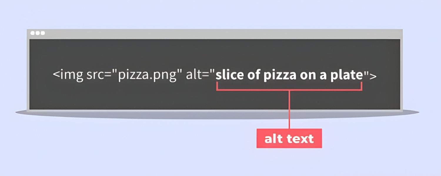
Alt text (alternative text) is a short written description of an image, provided through the image’s HTML alt attribute. Often called an “alt tag” or “alt attribute,” alt text serves as a substitute for the image itself.
In practice, this means if an image cannot be seen or loaded, the alt text conveys what the image is. For example, in HTML code an image might look like: <img src=”forest.jpg” alt=”Sunlight filtering through a dense forest canopy.”>.
Originally, alt text was introduced to improve web accessibility. Screen readers (assistive software for users with visual impairments) will read the alt text aloud whenever they encounter an image.
This enables users who cannot see the image to understand its content and purpose through words. Well-written alt text “conveys the meaning of an image in digital content” and dramatically improves the user experience for people with visual disabilities.
Alt text also appears in place of an image if the image fails to load or is blocked (for instance, by a slow internet connection or in an email client). This way, users still get some information instead of an empty gap.
Because of its dual role, alt text is considered essential in web standards. In fact, modern accessibility guidelines recommend that every image have an alt attribute, even if it’s empty (null) for images that don’t need descriptions. Simply put, alt text is the little snippet of text that speaks volumes when your images can’t.
Why Alt Text Matters
Alt text isn’t just a technical detail for compliance, it’s a bridge connecting your visual content to a broader audience and even to search engines. Here’s why it’s so important:
1. Accessibility and User Experience

For millions of users with visual impairments, alt text is nothing short of a lifeline to your content. When a screen reader reaches an image, it relies on the alt text to tell the listener what that image is about.
Without alt text, those users are left in the dark, missing critical information or context. It’s easy to see how a missing image description could cause confusion or frustration.
Conversely, well-written alt text makes your content perceivable and enjoyable for everyone, not just those who can see the images. It “reduces ambiguity and improves user experience” by providing textual clarity for visual elements.
Accessibility isn’t only about disability; alt text can help in other scenarios too. Think of users on a slow connection where images won’t load, or someone using a voice-controlled device that can’t display images.
Alt text ensures these users still get the gist. It also feeds into emerging technologies: for example, digital assistants and AI tools can use alt text to interpret and narrate image content.
In short, providing alt text is about offering equal access to information. It’s the right thing to do ethically, and it creates a better experience for a wider range of users, something any marketer can appreciate.
2. SEO Benefits and Discoverability
Alt text doesn’t just help users, it also helps search engines understand your images. Google and other search engines can’t “see” images the way humans do, so they rely on clues like alt text to determine what an image contains and how it relates to your page content.
According to Google’s own guidelines, descriptive alt text can improve your site’s image search results and even drive higher quality traffic to your site. Google explicitly notes: “By adding more context around images, results can become much more useful, which can lead to higher quality traffic to your site.” and “Google uses alt text along with computer vision algorithms and the contents of the page to understand the subject matter of the image.”
In practice, this means good alt text can help your images rank better in Google Images and improve the relevancy of your page for certain keywords.
From an SEO marketing perspective, alt text is a low-effort, high-impact way to enhance your content. It’s one of many ranking factors in the algorithm, and while it may not carry the weight of your page title or headings, it can still give you an edge.
For instance, if you have an e-commerce site, descriptive alt text on product images can help those products appear in image searches, potentially capturing shoppers who are searching visually. Alt text can also indirectly influence your page SEO by reinforcing context.
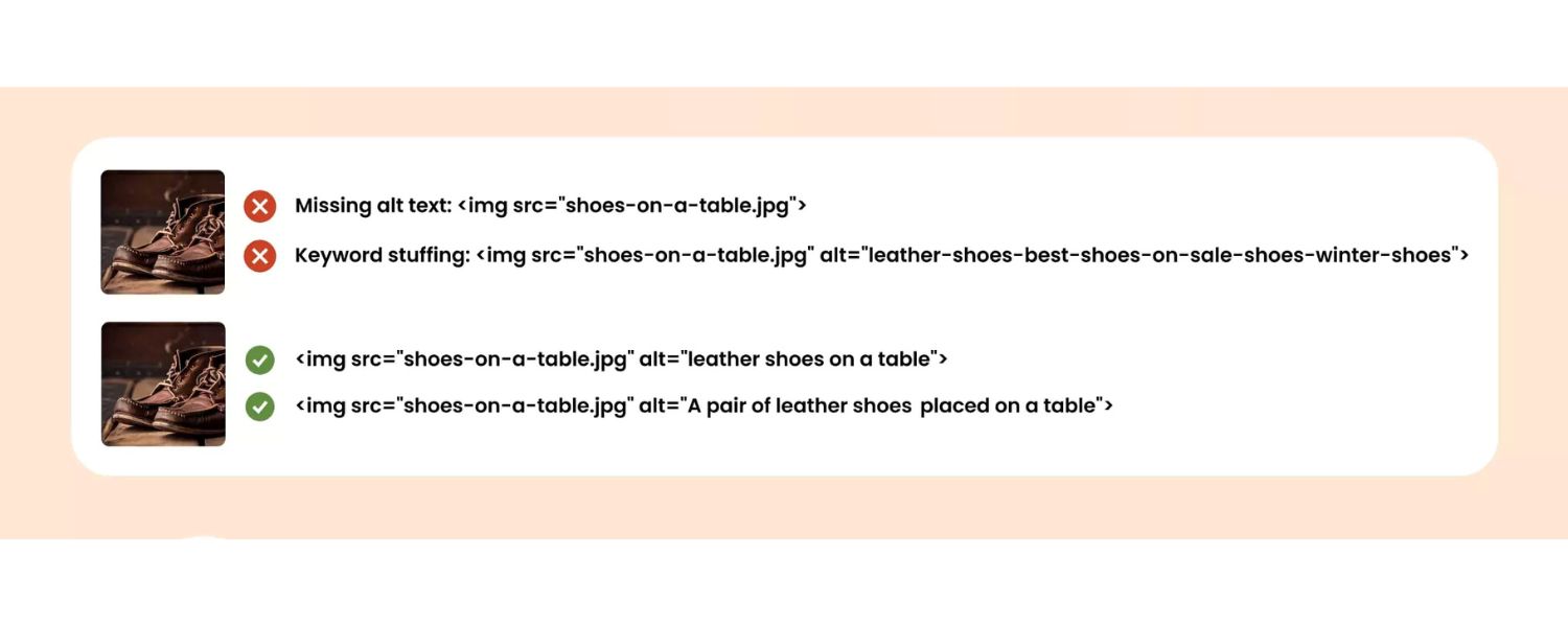
However, a word of caution: alt text is not the place for keyword stuffing. Include your focus keywords only if they naturally fit the image description. Stuffing alt attributes with irrelevant or excessive keywords not only detracts from the user experience but can also incur SEO penalties. The priority is always to describe the image meaningfully; any SEO boost is a secondary bonus of doing that well.
3. Legal Compliance and Inclusivity
Beyond user experience and SEO, there’s a compliance dimension to alt text. Laws and guidelines worldwide (such as the ADA, Section 508 in the U.S., and the Web Content Accessibility Guidelines) effectively require accessible images.
In fact, alt text is explicitly mandated in Section 508 standards for web and digital content. Organizations that ignore these requirements risk legal consequences. In recent years, there’s been a surge in accessibility-related lawsuits – with multi-million-dollar fines hitting businesses both big and small. Often, something as basic as missing alt text on key images is cited as a failure to accommodate users with disabilities.
Consider that over 55% of website homepages analyzed in one large-scale study had missing alt text on images. This not only represents poor accessibility across the web, but also a legal liability for those sites.
Ensuring your images have proper alt descriptions can help you avoid becoming part of those grim statistics. Moreover, demonstrating a commitment to accessibility enhances your brand’s reputation.
It shows your audience that you care about inclusivity and detail, which can be a competitive differentiator. Simply put, embracing alt text is good corporate citizenship, and it keeps the lawyers at bay. It’s hard to put a price on the goodwill and risk mitigation you earn by doing right by all users.
Does Every Image Need Alt Text?

You might be wondering if every single image on your site needs alt text. The answer is almost always yes, but with one important nuance: some images should have descriptive alt text, while others should have a null alt attribute (an empty alt=””).
In other words, all images need the alt attribute, but not all images require actual text in that attribute.
1. Decorative images
those that don’t add information or context, like purely decorative graphics, border designs, or background visuals – do not need descriptive alt text. In fact, giving a decorative flourish a verbose description would burden users with extraneous detail.
For such cases, the best practice is to use an empty alt attribute (alt=””) to mark the image as decorative. This signals to screen readers to skip over the image entirely, so listeners aren’t subjected to “image of a blue swirly line” or other non-essential info.
Many content platforms and editors (like Microsoft Word, PowerPoint, etc.) have a “Mark as decorative” option that effectively does this for you. By leaving the alt text blank on decorative images, you ensure assistive tech users can focus on your real content without distraction.
2. Redundant images
sometimes an image’s content is already explained fully by nearby text, like a chart that’s immediately followed by a written summary of its data. In these cases, providing a redundant alt description can annoy users by repeating information.
The rule of thumb: if the reader can understand everything even if the image wasn’t there, you can consider a null alt (alt=””) for that image. For example, if you have a thumbnail icon next to a hyperlink that’s labeled “Downloads,” and the icon itself is just a decorative arrow, the word “Downloads” already conveys the meaning.
You’d mark the arrow image as decorative with alt=”” to avoid the screen reader redundantly saying “Arrow” for no gain.
3. On the flip side, informative images absolutely do need alt text
Any image that contains content, illustrates a point, or provides functionality should have an alt description that conveys its meaning. This includes photos, illustrations, infographics, diagrams, and buttons or icons that perform an action.
If an image is a link or button, its alt text should communicate what that link or action is – essentially functioning like the link’s anchor text. For instance, a hyperlinked logo leading to your homepage might use alt=”CompanyName Home”, indicating the destination of the link.
If an image contains text (like a quote graphic or an event flyer), that text should be included in the alt text since it’s critical information. And if you’re showing a chart or graph, the alt text should summarize the key insight, not just label the image type.
Saying “Bar chart of quarterly sales” isn’t useful; something like “Bar chart showing Q4 sales were highest, at $1.2M, surpassing Q3’s $950K” is far more informative for someone who can’t see the chart.
Bottom line:
every <img> should have an alt attribute. Use real descriptive text for images that convey information or meaning. Use an empty alt for those that don’t. This approach satisfies both accessibility needs and SEO best practices (since even search engines don’t gain anything from indexing your decorative flourish images).
And remember – never omit the alt attribute entirely. If you leave it out, some screen readers will read the image’s file name or URL, which can be truly ugly (imagine hearing “image1234.png”). Having a blank alt is a conscious choice to mark an image as ignorable; missing alt is just an error.
How to Write Effective Alt Text (Best Practices)
Writing alt text is as much an art as it is a science. The goal is to convey the why and what of the image as succinctly as possible. Here are some best practices, drawn from accessibility experts and seasoned marketers, for crafting alt text that hits the mark:
1. Be Concise
Generally, keep alt text to a brief phrase or a single sentence. A good guideline is to stay under ~125 characters. This isn’t a hard rule, but some screen reader tools may cut off longer text, and a short description tends to be more digestible.
Most images can be described in a few well-chosen words. (If you find you need several sentences to do an image justice, that’s a clue the image might be too complex for alt text alone – more on complex images below.)
Microsoft’s advice is that “a few thoughtfully selected words” or at most “a sentence or two” is usually sufficient. Brevity ensures your description doesn’t turn into a speed bump in the reading flow.
2. Describe What’s Important (Context is Key)
Focus on the essential information or function the image provides in the context of your content. Think about why you included the image. Are you showing a product, setting a mood, explaining a concept? Your alt text should reflect that purpose.
For example, a photograph of a group of people might serve many purposes: if the article is about teamwork, your alt might be “Team members high-fiving in celebration” highlighting the camaraderie.
If the article is about a specific person in the photo, the alt might simply be that person’s name. You usually don’t need to literally describe every visual detail – describe the meaning or the story behind the image.
As one guide puts it, alt text should convey the “why” of the image, not just the “what”. Details like colours or exact layout are often unnecessary unless they’re important to understanding the image.
Always tailor your description to the context. (In fact, if you use the same image in different contexts, you may need to write different alt text each time to fit the contexttiny.cloud.)
3. Use Plain Language & Be Specific
Write alt text in a simple, clear manner as if you were describing the image to someone over the phone. Specificity helps. “A bird on a branch” is okay, but “A black-capped chickadee perched on a snowy branch” is more vivid and informative, especially if that detail matters.
However, avoid flowery or figurative language. This isn’t the place for poetic metaphors that could confuse. State exactly what the image is or conveys, as directly as possible.
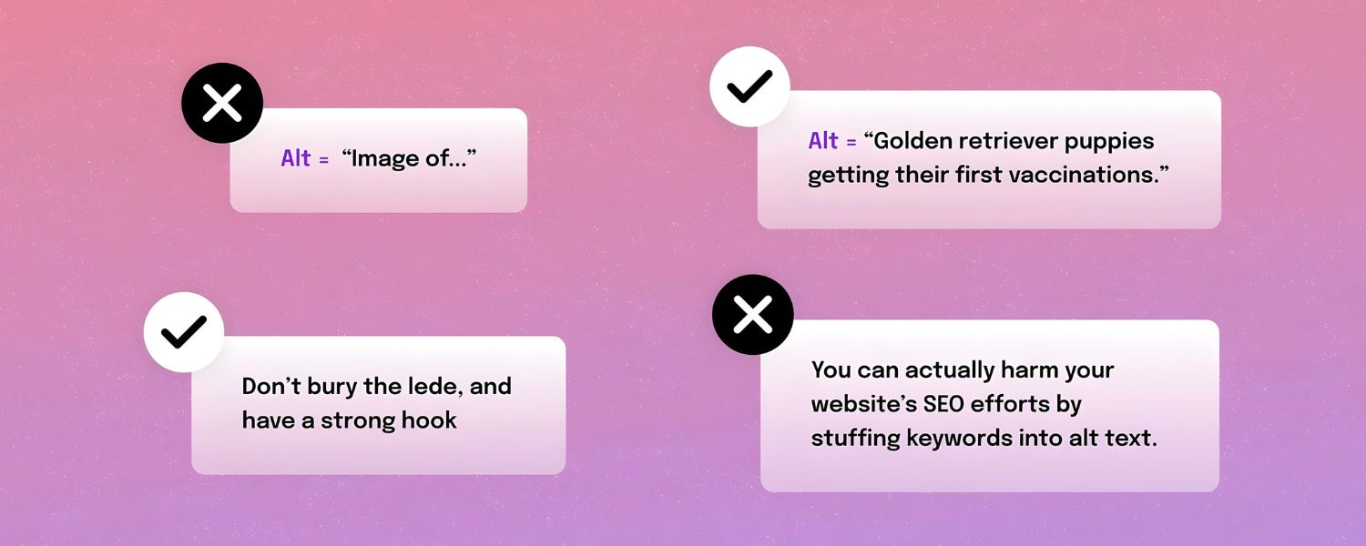
4. Avoid Redundant Phrases
Do not start your alt text with “Image of…,” “Picture of…,” “Graphic of…,” etc. Screen readers already announce an image element, so saying “image” again is repetitive. For example, alt=”Image of a smiling customer” would be read aloud as “Image, image of a smiling customer” – not a great experience!
Just jump straight into the description: “Smiling customer giving a thumbs up.” Similarly, avoid saying “photo by [photographer]” or “graphic” in the alt – those details aren’t useful to understanding the content (unless the photographer’s credit is contextually important, which is rare). The alt text is not a caption; it’s a replacement for the image’s content.
5. Don’t Repeat Existing Text
If the image’s context is already provided by surrounding content, you don’t need to restate that in the alt. For instance, if a paragraph already describes the data in a chart, you might use a short alt like “Bar chart illustrating the described sales data” or even alt=”” in some cases.
Likewise, if an image has a caption right below it that explains it fully, the alt can be very minimal or empty. The key is to avoid redundancy that would waste the listener’s time.
Every word in your alt text should add value. One common mistake is copying the page text verbatim into the alt attribute – this doesn’t help users at all. Either add new info or leave it blank.
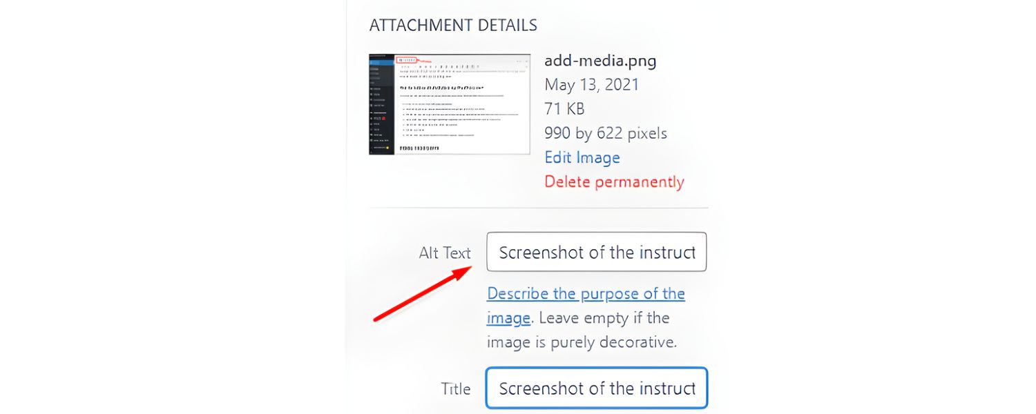
6. Include Text in Images

If your image contains important text (like an infographic with labels, a quote, or a banner with event info), include that text in the alt exactly as it appears. For example, if you post an image that says “Grand Opening Sale – 50% off all items this Saturday!”, your alt text should convey that: alt=”Grand Opening Sale – 50% off all items this Saturday.”
The user can’t see the fancy font or colors, but they need the message. (As a side note, from an accessibility standpoint, using actual text in HTML is preferable to embedding text in images, but if you must, then alt text is your savior here.)
7. Mind Your Punctuation and Case
Write alt text like a normal sentence or phrase. Capitalise the first word and end with a period (especially if it’s a full sentence). Proper punctuation ensures that screen readers pause appropriately – for instance, many screen readers will pause at a period, giving a clear break between the alt text and the following content.
Avoid using ALL CAPS, even if the image has a word in caps. All caps can be misinterpreted as acronyms (example: “DOG” might be read as D-O-G) and can be harder for some readers to comprehend. Treat alt text like you would any well-written snippet of copy: grammatically correct and easy to read.
8. Keep It Neutral and Objective (Usually)

In most cases, stick to describing what is present without injecting your personal interpretation. However, there are times when describing the emotion or tone of an image benefits the reader.
Images often convey feelings, a sarcastic smirk, a joyous celebration, etc. If the emotion is important to the context, you can and should include it (e.g., “A wide-eyed cat smiling sarcastically at the camera”).
Just be careful not to assume too much or use vague terms. Saying “a happy family” is fine if it’s evident, but saying “a kind man” might be projecting an attribute that isn’t directly visible.
When in doubt, focus on visible cues (e.g., “smiling,” “with arms raised in victory,” “tears of joy in eyes”). These details can make the experience richer for someone who can’t see the image.
9. Highlight Key Differences or Insights
If your image is conveying data or a comparison, the alt text should reflect the takeaway. Don’t just label the image type. For a chart or graph, mention the key trend or result (“Line graph showing energy usage peaking in 1975” rather than “Line graph of energy use over time”).
For a before-and-after image, mention the difference (“Living room before renovation (top) and after renovation with new furniture (bottom)”). For an image that serves as a link or button, make sure the alt text tells users what will happen if they click it (“Search icon – opens search bar” or “Facebook icon, link to our Facebook page”). Effective alt text often doubles as micro-copy that guides the user.
10. Avoid Keyword Stuffing

Yes, from an SEO standpoint you want to include relevant keywords in your alt text, but always do so naturally. The primary purpose of alt text is not SEO – it’s accessibility.
So never shoehorn extra keywords or irrelevant phrases in. For example, if you have an image of a red running shoe on a product page, a good alt might be “Red running shoe with white sole.” Cramming in “running shoe men’s running shoe best running shoe red buy now” is bad form.
Not only will this irritate users, it can backfire with search engines. Google’s algorithms are quite sophisticated and will penalize obvious keyword stuffing. The rule: describe the image, and if that naturally includes a keyword you target, great. If not, don’t force it. There are other places for SEO content; keep alt text user-focused.
11. Handle Complex Images Wisely
Some images, like detailed infographics, maps, organizational charts, or flow diagrams, carry too much information to fully describe in a one-liner alt text. In these cases, write a brief alt text that names the image and indicates that a fuller description is available.
Then provide the detailed description in the body of the page or as a separate resource. For example, an alt might say, “Timeline infographic of company history (details below).” Then, in the page text or a caption, you’d include a paragraph explaining the infographic’s content.
This two-tier approach ensures the immediate content is accessible and the finer details are still available for those who need them. (The HTML longdesc attribute was once intended for this purpose, but it’s largely obsolete and not well-supported, so simply using regular text or linking to a description page is preferred.)
The key takeaway: alt text should be as concise as possible, and additional context can live elsewhere if needed.
12. Be Consistent for Repeated Images
If you have a recurring image (like a logo or icon used throughout a site in the same context), use consistent alt text each time for that image. This provides a predictable experience.
For example, if your company logo’s alt text is “Acme Corp logo,” use that every time the logo appears in a similar context (and remember, if the logo is just a decoration somewhere, you might choose to alt=”” that instance). Consistency helps especially for screen reader users who might navigate across pages; they won’t have to wonder if “Acme Corporation” and “Acme Corp logo” are two different images or entities – they’ll hear the same phrase and know it’s the familiar logo.
13. Test with Real Users or Tools

Finally, it’s wise to audit your alt text with tools or by listening to it yourself. Many automated checkers (such as browser extensions or accessibility checkers) can highlight images missing alt text.
Even better, turn on a screen reader (such as NVDA or VoiceOver – which are free) and navigate your page. Experience firsthand what your alt text sounds like. Is it clear and helpful when read in sequence with the rest of the content? This practice can reveal awkward phrasing or unintended redundancies.
It’s the ultimate quality assurance for alt text. As a marketer, you might also consider that some email marketing tools or CMS platforms show alt text in place of images for users who disable images.
A quick review ensures your messaging is coming through in those cases as well. In short: proof your alt text like you would proof any copy. It’s part of your content, and it contributes to the overall impression of quality.
Alt Text Example- Good vs. Bad:
To illustrate these principles, let’s look at a quick example. Suppose you have a historical article and include a famous photo of Dr. Martin Luther King Jr. giving a speech. What should the alt text be? A novice might write something like: “Black and white photo of an African American man in a suit and tie standing at a podium with microphones.”
Technically, that describes the photo, but it misses the point. It’s verbose and focuses on visual details irrelevant to why the image is used. A better alt text would simply be: “Dr. Martin Luther King Jr. speaking at a civil rights rally.” This alt text identifies the subject and the context (civil rights rally) which is presumably why the image is in your article.
It’s concise and meaningful. The user doesn’t actually need to know about the suit and tie or the fact it’s black-and-white; those details don’t convey the significance of the image. Always aim for the “just right” description that conveys the purpose.
By applying these best practices, your alt text will not only satisfy technical requirements, but also delight users and even give your content a competitive edge. It’s a skill that improves with thought and practice, much like any good writing.
Conclusion and Next Steps
Alt text may be just a few words per image, but its impact on your website’s success is substantial. By now, you’ve seen that writing effective alt text is about balancing brevity, context, and clarity.
When done right, alt text makes your content accessible to all users, enhances the overall user experience, improves your SEO (especially for image search), and keeps your site in line with legal accessibility standards. It’s a small investment of effort for a significant return in audience reach and engagement.
As a marketing expert would advise:
make alt text an integral part of your content creation workflow. Each time you add an image to a blog, product page, or social media post, take a moment to craft a meaningful alt description.
Train your team and content creators to treat alt text with the same care as a headline or call-to-action. You can even conduct an audit of your existing content – you might be surprised how many images are missing alt text or have subpar descriptions. Tackle those gradually, focusing on high-traffic pages first.
Most importantly, foster a mindset that prioritizes the end user’s experience. Empathize with someone who can’t see the visuals: would your alt text truly inform and satisfy them? By keeping that question at the forefront, you’ll naturally create better alt text and better content overall.
Call to Action:
Don’t leave your images silent. Start applying these alt text best practices to your site today. Update a few images with fresh, descriptive alt tags and see the difference – not just in compliance reports or search console data, but in knowing that you’ve made your content more welcoming to everyone.
In a competitive digital landscape, the details matter. Alt text is one of those details that, when handled wisely, can set your brand apart as both inclusive and SEO-savvy. So take the next step: review your latest blog or homepage now, and give every image a voice. Your audience (and even Google’s bots) will thank you for it.

Shopify SEO: Guide to Ranking Your Store and Driving Sales
Most Shopify store owners set up their store, list their...

Content Marketing : Definitive Guide to Strategy, Content Types, and Measurable ROI
Content marketing generates 3x more leads than outbound marketing at...

Above the Fold: Guide to Conversions, Rankings and Faster Pages
Above the Fold in 2026: The Complete Guide to Conversions,...

Off-Page SEO Checklist: Guide to Building Real Authority
Most websites spend months creating great content, only to wonder...

What Is Keyword Bidding? The Complete Strategy Guide for Smarter Ad Spend
Most advertisers believe the highest bid wins the auction. It...
.png)
.png)
.png)
.png)
.png)

2026 ALL RIGHTS RESERVED MADE IN INDIA
.png)