Mobile SEO: Best Practices to Optimize Your Site for Mobile
August 21, 2025
Mobile usage isn’t the future, it’s the present. More than half of all web traffic now comes from mobile devices, and Google has shifted to mobile-first indexing, meaning it predominantly uses your site’s mobile version for ranking and indexing. If your website isn’t optimized for smartphones and tablets, you risk losing visibility, traffic, and customers. In this comprehensive guide, we’ll cover what mobile SEO is and how to do it right, with actionable best practices (and the latest 2024/2025 data) to help you stay ahead in a mobile-first world.
What Is Mobile SEO and Why It Matters
Mobile SEO is the practice of optimizing your website to rank well on search engines when users search from mobile devices. It involves ensuring your site’s content, design, and technical setup deliver a fast, seamless experience on smaller screens. In many ways, mobile SEO includes all the traditional SEO tactics (quality content, on-page optimization, links, etc.), but with additional focus on user experience and technical performance for mobile users.
Why is mobile SEO so important? Consider these facts:
1. Mobile Traffic Dominance
As of 2025, roughly 64% of all website traffic comes from mobile devices. In other words, mobile users now generate well over half of all internet activity. For Google specifically, mobile visitors make up an estimated 83.5% of total search traffic. Ignoring mobile SEO means potentially ignoring the majority of your audience.
2. Mobile-First Indexing
Google has fully rolled out mobile-first indexing, which means Google’s index now predominantly uses your mobile site’s content for ranking decisions. If the mobile version of your site is lacking (e.g. less content or poor usability), your rankings will suffer even for desktop searches.
3. User Experience and Conversions
Mobile users are often on the go and expect fast, easy-to-use sites. If a mobile page takes over 3 seconds to load, most users will abandon it, in fact, as page load goes from 1s to 5s, the probability of bounce increases by 90%. Poor mobile experience (slow speed, tiny text, hard-to-click buttons) can cost you engagement and sales. On the flip side, a great mobile experience can improve user satisfaction, time on site, and conversion rates, which send positive signals to search engines.
In short, optimizing for mobile isn’t optional anymore, it’s absolutely critical. Next, let’s dive into best practices to ensure your site is mobile-friendly and primed to rank.
Use Responsive Web Design (Mobile-Friendly Site)
The foundation of mobile SEO is having a mobile-friendly website. This means your site’s layout and content adapt to different screen sizes and device types. Responsive web design is the most recommended approach: it serves the same HTML and URL to all devices, but CSS media queries adjust the display for screens. Google explicitly recommends responsive design as the ideal configuration, because it’s simpler to implement and maintain than separate mobile sites. With a responsive site, you won’t have to worry about duplicate content or missing content on mobile – everything is one unified site.
Alternatives like dynamic serving (different HTML by device) or separate mobile URLs (e.g. an “m.example.com” site) can work, but they require extra care. If you use these setups, be sure to maintain parity between desktop and mobile content (more on that below) and use proper tags (like rel=”alternate” and rel=”canonical”) so Google knows the relationship. For most sites, going responsive is the easiest path to mobile-friendliness.
Key mobile-friendly design tips:
1. Ensure text is readable without zooming: Use legible font sizes and avoid forcing users to pinch-to-zoom. Google’s mobile test checks that “text on the page is readable” by default.
2. Make links and buttons touch-friendly: Aim for tap targets (buttons, nav links, etc.) of at least ~48px in size, with sufficient spacing around them so that thumbs can easily tap the right element. Crowded links that are too small lead to frustrating mis-taps.
3. Use a meta viewport tag: This <meta name=”viewport” content=”width=device-width, initial-scale=1″> tag ensures the page adapts to the device’s width. Without it, mobile browsers may display your page zoomed-out and shrunken. A correct viewport is a basic requirement for passing mobile-friendly tests.
4. Avoid horizontal scrolling: Design your layouts so content fits the small width. Images and tables should be fluid or use max-width to scale down. Users shouldn’t have to scroll side-to-side to read content.
5. Test on real devices: Emulators are helpful, but also test your site on actual phones and tablets of various sizes. This helps catch navigation issues, overlapping elements, or other quirks that tools might miss.
Your goal is to provide a “app-like” seamless experience on mobile, content that’s easy to read and interact with, without any annoying zooming or broken layouts. Google’s own mobile-friendly testing tools (e.g. Bing’s Mobile Test or Chrome DevTools’ device mode) can quickly flag if you have issues in these areas.
Prioritize Site Speed and Performance (Core Web Vitals)
On mobile, speed is king. Mobile users are often on slower networks or have less patience for delays. Google recognizes this by incorporating page speed and Core Web Vitals into its ranking factors for page experience. Here’s how to optimize your mobile site’s performance:
1. Optimize loading speed
Aim for your pages to load in under 3 seconds on typical mobile connections. Faster is better – studies show a huge drop-off in user engagement as load times creep up beyond a few seconds. Google’s research found that a jump from 1s to 5s in load time increases bounce likelihood by 90%.
Start with the basics: compress images, minify CSS/JS, leverage browser caching, and use asynchronous loading for scripts. Tools like Google PageSpeed Insights can analyze your site and suggest fixes (e.g. minify resources, eliminate render-blocking scripts).
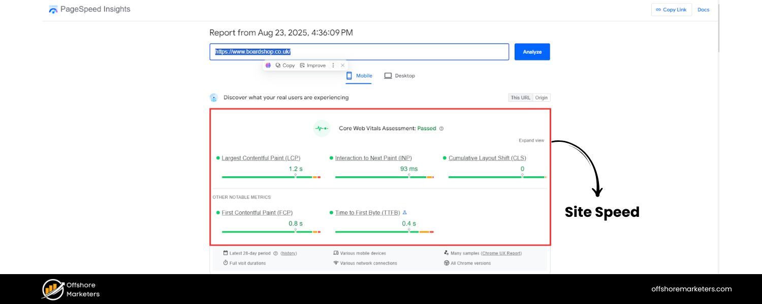
2. Core Web Vitals focus
Pay attention to metrics like Largest Contentful Paint (LCP), Cumulative Layout Shift (CLS), and Interaction to Next Paint (INP) – the new responsiveness metric replacing First Input Delay in 2024. For mobile users, you want LCP under ~2.5s, CLS below 0.1, and INP under 200ms for a good experience. These ensure your content loads quickly, stays visually stable, and responds fast to taps.
3. Use modern image formats & lazy loading
Images are often the largest elements on mobile pages. Convert heavy old formats to modern ones like WebP or AVIF, which provide comparable quality at smaller file sizes. Also implement lazy loading for images and videos – i.e. load them as the user scrolls near them, rather than all upfront. This reduces initial load payload. (Just make sure critical content isn’t lazy-loaded such that it requires user interaction to appear, or Google’s crawler might not see it.)
4. Optimize your server and delivery
Mobile devices benefit from fewer round-trips. Use techniques like content delivery networks (CDNs) to serve content from a location closer to the user, and enable compression (Gzip or Brotli) to shrink file sizes. Reducing server response time (to <200ms) also helps the overall TTFB (time to first byte) which improves perceived speed.
5. Minimize JavaScript and third-party scripts
Mobile CPUs are less powerful, so heavy JavaScript can really bog down rendering. Audit your scripts – remove or defer any non-essential JS. For necessary scripts, use lighter alternatives if possible. The same goes for bulky CSS frameworks: load only what you need. Every byte and script counts on mobile.
6. Test on 3G/4G speeds
Simulate slower network conditions to see how your site performs for users without fast Wi-Fi. Chrome DevTools and WebPageTest allow you to throttle the connection for testing. This can reveal, for example, if your fancy slider script is taking 8 seconds to load on a typical 4G phone – which means it’s gotta go or be optimized.
Speed improvements not only help SEO but directly improve user engagement and conversion. For instance, a site that loads in 1 second can have significantly higher conversion rates than one that loads in 5 seconds. By hitting good Core Web Vitals scores and keeping your mobile pages lightweight, you’ll please users and Google’s ranking algorithms.
Ensure Content Parity for Mobile-First Indexing

One common mistake site owners made in the past was serving “stripped-down” content on their mobile site – for example, showing only partial articles or fewer images on mobile to save space. Avoid doing this. With mobile-first indexing, the content on your mobile version is what counts for search indexing. If your mobile pages have less content or missing sections compared to desktop, Google won’t see that missing content at all, which can hurt your rankings and relevance.
Follow these content parity best practices:
1. Same primary content on mobile and desktop
Make sure all the important text, images, and features available on desktop are also present on the mobile site. It’s fine to use accordions or tabs to tuck away long content on mobile (for better UX), as Google still treats hidden-but-available text as normal content. But do not simply omit significant content for mobile users. If you intentionally leave out content on mobile, expect some ranking drops because Google sees a less comprehensive page.
2. Match headings and structure
Use the same clear headings (H1, H2, etc.) on mobile as on desktop. Your structured outline of the page should remain consistent. For example, if your desktop page has a section called “Features and Benefits” with bullet points, your mobile page should include that as well (perhaps in an expandable section).
3. Consistent metadata
Use identical title tags and meta descriptions on both mobile and desktop pages. Don’t have a shortened or different title on mobile. The SEO title and description that Google sees should be equivalent, ensuring consistency in how your page appears in search results regardless of device.
4. Structured data on both versions
If you use Schema markup (JSON-LD, etc.) or other structured data, it must be present on the mobile version too. For example, if your desktop page has FAQ schema or product markup, the mobile page should include the same structured data. Also, make sure any URLs in the markup are updated for the mobile version (if using separate URLs). Consistency here helps preserve rich results eligibility after the mobile-first switch.
5. Media and alt text
Include all relevant images and videos on mobile that you have on desktop, and use the same alt text captions and titles for them. Don’t remove descriptive media or captions on mobile; they contribute to your content’s relevance and accessibility. Google warns that having lower-quality or tiny images on mobile (compared to desktop) can hurt how your content is evaluated, so use high-quality, properly sized images even on mobile (you can scale them down via CSS, but don’t swap to super-low-res files).
6. Avoid “mobile-only” content differences
Aside from layout adjustments, your mobile and desktop content should be serving the same purpose. If something is critical to the topic (keywords, depth of information), it needs to be on mobile. The mobile site is effectively your whole website as far as Google is concerned now.
By aligning your content and SEO elements across mobile and desktop, you ensure that the mobile-first index isn’t missing anything. This way, you won’t experience a drop in rankings due to a weaker mobile version. To check, use Google’s URL Inspection tool in Search Console on your mobile URLs – see if the indexed page content is complete. Also, manually compare a few key pages: desktop vs mobile side by side. If you spot any gaps, fill them. “Consistency is key in the mobile-first era,” as Google’s guidelines emphasize.
Optimize Mobile User Experience (UX)

Mobile SEO isn’t just about appeasing Google’s bot, it’s about delighting real users on their phones. Google’s algorithm increasingly factors in user experience signals, and a good mobile UX can indirectly boost SEO through lower bounce rates and higher engagement. Here are important UX considerations:
1. Simplify Mobile Navigation
Navigation menus should be accessible and easy to use on small screens. Consider using a clean “hamburger” menu or visible tab bar with a few key sections. Keep top-level menu items limited (e.g. 5-7 items) to avoid overwhelming the user. Use clear, descriptive labels for menu options (e.g. “Contact Us” instead of just an icon).
Additionally, make sure your menu and important links are placed within easy reach of a thumb – often towards the bottom of the screen or using large, bottom-oriented buttons for one-handed use. An intuitive menu keeps users browsing longer, which is great for SEO.
2. Design for touch and thumbs
We mentioned touch targets earlier – this is crucial for forms, buttons, and any interactive element. Also consider the placement of critical buttons. For example, a floating call-to-action button in the bottom corner might cover other content or be hard to tap if it’s too small. Ensure forms are mobile-optimized (use appropriate input types, enable auto-fill where possible, and keep them short).
3. Avoid Intrusive Pop-ups
Intrusive interstitials (pop-ups or banners that cover content) can ruin the mobile experience, and Google actively penalizes sites that use intrusive pop-ups immediately on page load. Since January 2017, Google’s ranking algorithm may devalue pages with intrusive interstitials on mobile, considering them not mobile-friendly.
Examples include splash screens forcing an app download, full-screen ads that must be dismissed, or any modal that hides content behind it. If you must use a popup (like for legal notices or login), make it as unobtrusive as possible – e.g. use a small banner or delayed trigger, and ensure it’s easily dismissible. The content of your page should be readily accessible without impediment.
4. Mobile-Friendly Layouts
Use single-column layouts for content where possible (multi-column text doesn’t work on narrow screens). Break up long paragraphs into shorter chunks. Utilize subheadings, bullet points, and whitespace generously – mobile readers tend to scan. A dense block of text that might be okay on desktop can turn into an endless scroll on mobile, so format accordingly. Also, use larger font sizes for body text (at least 14px, but 16px+ is often recommended for readability on mobile).
5. Consider Mobile Behavior Patterns
Mobile users often look for quick info – your design should accommodate that. For instance, put important information (product price, phone number, CTA buttons) front and center. If you have a local business, make sure your address or a “Call” button is prominent for mobile visitors. Think about common tasks a mobile user might want to do on your site and make those easy (e.g. site search bar easily tappable, store locator visible, etc.).
6. Use visual cues and feedback
On mobile, it’s helpful to give users clear feedback. If a button is pressed, provide a subtle animation or color change. Ensure interactive elements are obvious (e.g. underline links or use buttons). Also, ensure that if content is loading (like via AJAX), you show a loading indicator. This improves perceived speed and keeps users from getting confused.
A positive mobile UX not only keeps users engaged (reducing pogo-sticking to search results) but is also part of Google’s Page Experience update considerations. Remember, 57% of users say they won’t recommend a business with a poorly designed mobile site. By streamlining your mobile UX – simple navigation, readable content, no annoying pop-ups, you send a strong signal to users and search engines that your site is high quality and worth ranking.
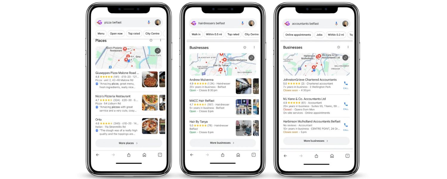
Leverage Local SEO for Mobile Users
Mobile search and local search often go hand-in-hand. Many mobile users search for things “near me” or need immediate local information while on the move. In fact, nearly half (46%) of all Google searches are seeking local information, and a large portion of those happen on mobile devices. This means if you have any local or location-based aspect to your business, optimizing for local mobile searches is crucial.
Key steps to optimize for local mobile SEO:
1. Ensure mobile-friendly local pages
If you have location-specific pages (e.g. “Store Locator” or individual branch pages), make sure they are mobile-optimized just like the rest of your site. Include your NAP (Name, Address, Phone) prominently, and perhaps a clickable phone number and Google Maps link for “Get Directions.” Mobile users should be able to quickly find how to contact or visit you.
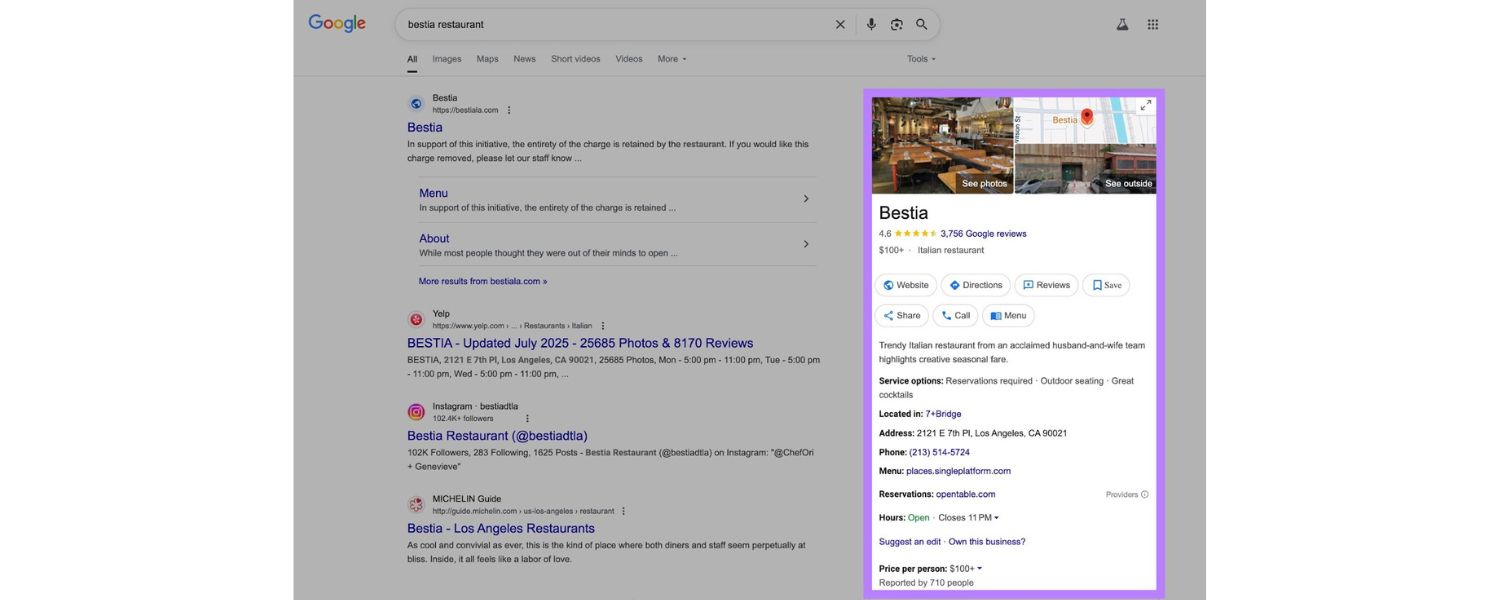
2. Google Business Profile

Claim and optimize your Google My Business (Google Business Profile) listing. Mobile searches with local intent often trigger map pack results or knowledge panels. By having an up-to-date profile (correct address, hours, reviews, etc.), you increase your chances of appearing in those prominent results. This is especially important for “near me” searches. Also encourage happy customers to leave reviews, good ratings can improve your local visibility.
3. Localized Content
If relevant, include local keywords in your content and meta tags. For example, a dentist’s site might have “Family dentist in [CityName]” in the title or H1. Write blog posts or pages that cater to local interests or events if appropriate, as this can boost relevance for local queries. However, avoid keyword stuffing the city name everywhere – keep it natural.
4. Location-specific Schema
You can use LocalBusiness schema or Organization schema with your location details on your site to give search engines structured info about your business. While not a direct ranking factor, structured data can enhance how your listing appears (and ensures Google has accurate data).
5. Optimize for “Near Me” searches

Users often type or voice-search queries like “best pizza near me” on mobile. To capture these, make sure your content (or meta tags) include phrases like “best pizza in [Your City]” which aligns with what “near me” implies. Also, having a physical address in the city and embedding a Google Map on your site can help reinforce local relevance. Remember that 76% of people who search on their smartphones for something nearby visit a business within a day, according to Google data – so being visible in those moments is key.
Local SEO is a broad topic in itself, but the core idea is: optimize for mobile local searches by providing accurate, easily accessible local information. Many of these steps overlap with general local SEO, but you want to double-check everything looks and works great on mobile, since that’s where many of your customers will find you first.
Optimize for Voice Search Queries
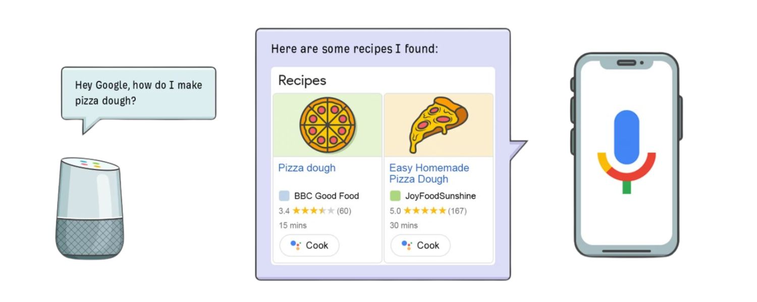
With the rise of Siri, Google Assistant, Alexa, and other voice assistants, voice search has become a significant part of mobile search behavior. Some studies predict that by the mid-2020s, close to 50% of all searches may be voice-based. Voice searches tend to happen on mobile devices or smart speakers, and they have a few distinct characteristics that are worth optimizing for:
1. Target conversational keywords
Voice queries are usually longer and phrased more like natural language. For example, a text search might be “weather tomorrow [city]” whereas a voice search might be “What will the weather be like tomorrow in [city]?” Brainstorm the questions users might ask related to your business.
Incorporating long-tail, question-based keywords in your content can help capture these queries. Consider adding an FAQ section on key pages, explicitly writing questions (“How do I…”, “What is the best…”) and succinct answers. This can align perfectly with voice searches and even get you featured snippets.
2. Aim for Featured Snippets (“Position Zero”)
A high percentage of voice search answers are drawn from the featured snippet of a search result (the concise answer box on Google). To increase your chances, structure some content in Q&A or bullet-point format, use clear heading definitions, and directly answer common questions in the first few sentences. If you can grab a snippet on a traditional search, that’s likely the answer a voice assistant will read out.
3. Use Schema markup
Implementing FAQ schema, HowTo schema, or QAPage schema for pages that answer questions can help search engines better understand and potentially surface your content for voice queries. Structured data also makes you eligible for rich results, which can indirectly boost voice visibility. For instance, marking up an FAQ page might not only show rich results on mobile SERPs but also be a source for voice answers.
4. Optimize for local voice queries
Many voice searches are local (e.g. “Where’s a good coffee shop nearby?”). We covered local SEO above – make sure those bases are covered (Google Business Profile, etc.). Additionally, ensure your content uses natural language that includes local terms (like mentioning neighborhoods or landmarks in your directions/contact page). Voice users often ask for “best” or “nearest” – having user reviews and pages that include phrases like “best coffee shop in [town]” can align with those superlative searches.
5. Fast and mobile-friendly is key
Voice search users expect immediate answers. Google tends to prefer sites that load fast and run efficiently for voice query answers. If a voice assistant pulls from your page, it helps if your page loads quickly and is easy to parse. Also, if the assistant opens your site (for example, on phones, Google Assistant might open the webpage), you’ll want to have a clean AMP or very mobile-optimized page so the user can easily get more info.
Remember, people use voice search differently – often phrasing queries in question form, sometimes with more urgency or local intent, and usually expecting a direct answer. By adapting your content to answer questions directly and conversationally, you increase your chances of capturing traffic from voice assistants. Voice SEO is still emerging, but it’s closely tied to good mobile SEO practices: fast sites, structured content, and a focus on user intent.
(Pro tip: Think about the kinds of questions your target customer might ask their phone or smart speaker about your product/service, and make sure your site provides the answers.)
Implement Structured Data & Rich Snippets

Structured data (schema markup) doesn’t change your site’s appearance to users, but it gives search engines extra context about your content – and on mobile search results, rich snippets can stand out even more. While not strictly a “mobile-only” SEO tactic, using structured data is particularly beneficial for mobile SEO:
1. Enhanced mobile search appearance
Mobile SERPs are smaller, so having rich results (stars, FAQs, images, etc.) can take up more screen real estate and attract clicks. For example, if you add FAQPage schema to a Q&A section, your result might show an accordion of questions in the mobile results. Or using Review/Rating schema can display star ratings. These enhancements can improve your click-through rate.
2. Better understanding of content
By marking up things like products, recipes, events, or articles with schema, you help Google accurately interpret your content. For instance, marking up a business address with LocalBusiness schema can reinforce local signals (complementing your Google Business Profile).
Or marking up an article with the Article schema ensures Google knows details like the headline, author, and publish date, which can be useful for inclusion in Google News or Discover (commonly consumed on mobile).
3. Voice search synergy
As noted, structured data can assist with voice search results. Google might use schema (like HowTo or FAQ) to provide voice answers or actions. For example, marking up a recipe with Recipe schema could enable Google Assistant to guide a user through the recipe step by step on a smart display or phone.
4. Mobile-specific structured data
There are certain schema types specifically relevant to mobile or app SEO, like MobileApplication for app indexing or Speakable (beta) which is intended to highlight sections of content that are suited to be read aloud by voice assistants (for news sites). If applicable, consider these. Speakable, for instance, can be used to indicate which parts of a news article are a summary to be read by Google Assistant.
Implementing structured data should be done carefully according to Google’s guidelines, always test your markup with Google’s Rich Results Test tool to ensure it’s valid and being detected. Keep in mind that schema markup does not guarantee a rich result, but it’s a necessary step to be eligible for one.
In summary, structured data is an “extra credit” that can boost your mobile SEO by making your search listings more informative and eye-catching. It also future-proofs your site for evolving search formats (voice, rich cards, etc.). Many competitors may not take the time to implement schema, so doing so can give you an edge.
Test and Monitor with Mobile SEO Tools
Optimizing your site is not a one-and-done task, you should continuously test, monitor, and refine your mobile SEO efforts. Thankfully, there are plenty of tools to help:
1. Google Search Console (Mobile Usability report) 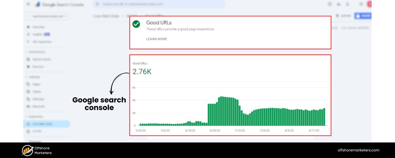
This free tool is indispensable. In Search Console, check the Mobile Usability report which flags pages with issues on mobile (like clickable elements too close, content wider than screen, etc.). Also use Search Console to monitor your mobile search traffic and rankings.
You can filter performance reports by device = “Mobile” to see how you’re doing specifically on mobile searches. If Google encounters mobile-specific crawl issues, it will report them here.
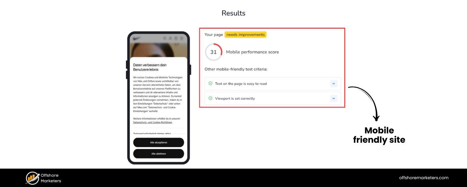
2. Google’s Mobile-Friendly Test
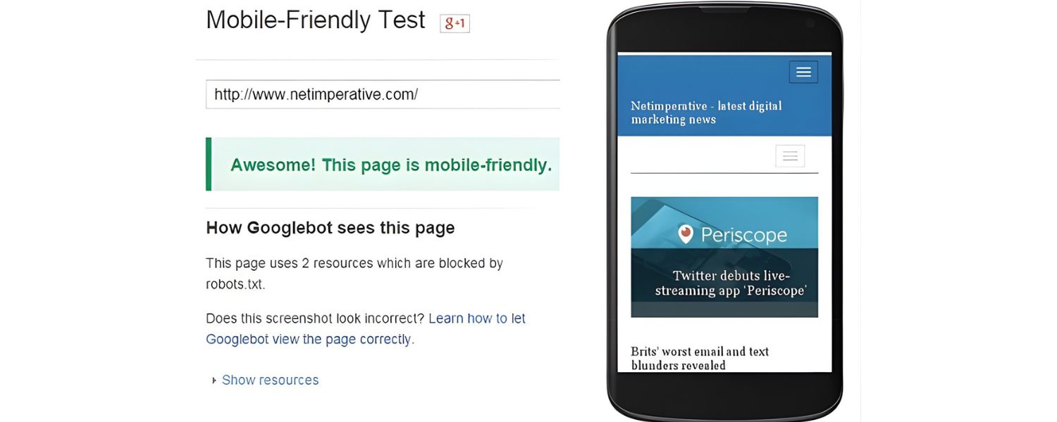
Although Google removed the old mobile-friendly testing tool from Search Console, you can still use the public Mobile-Friendly Test online. Enter your URL and it will tell you if the page passes, and list specific issues if not (e.g. “text too small to read” or “uses incompatible plugins”). It’s a quick way to audit individual pages.
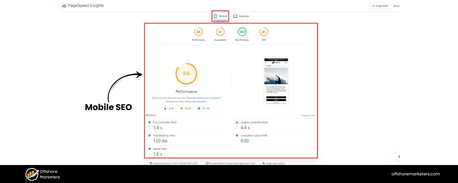
3. PageSpeed Insights and Lighthouse

We’ve mentioned these for speed, use PageSpeed Insights (which now uses Lighthouse under the hood) to get lab and field data on your mobile page performance. It will give you Core Web Vitals metrics and suggestions. Lighthouse (in Chrome DevTools or via the Chrome extension) can also simulate a mobile device and provide scores for Performance, Accessibility, Best Practices, and SEO. Pay special attention to the Performance score for mobile and the opportunities it lists.
4. Third-party testing tools 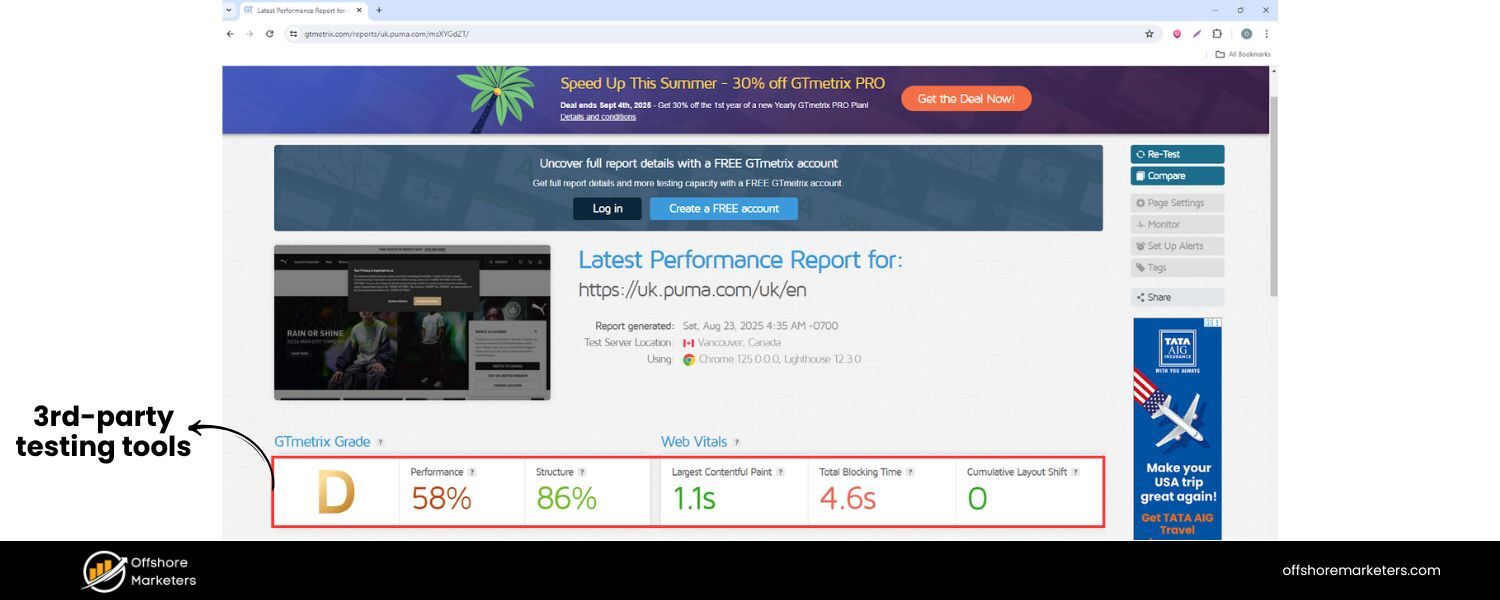
Tools like WebPageTest, GTmetrix, or Pingdom allow testing your site from different locations and network speeds, with detailed waterfall charts of load processes. These can help identify specific files or scripts causing slowdowns on mobile. WebPageTest even has presets for mobile devices and can throttle to 3G or 4G speeds for realistic conditions.
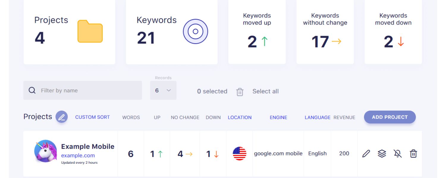
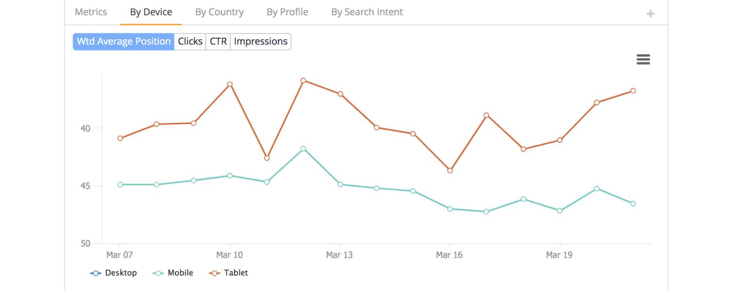
5. Mobile rank tracking
If you’re serious about SEO, consider using an SEO platform or rank-tracker that allows tracking mobile rankings separately from desktop. Many tools (Semrush, Ahrefs, etc.) let you specify device type and location. This way, you can see if you rank differently on mobile vs desktop.
It’s not uncommon, due to things like localized results and the mobile-first index, for rankings to diverge. Keeping an eye on mobile positions helps you measure the true impact of your optimizations.
6. Analytics Segmentation
Use Google Analytics (GA4) to segment traffic by device. Analyze mobile user behavior, do they bounce more on certain pages? Are conversion rates lower on mobile for specific funnels? This can highlight pages that need UX improvements on mobile.
For example, if your checkout page has a 70% drop-off on mobile vs 50% on desktop, that’s a clue something on the mobile checkout experience needs fixing. GA4’s built-in reports (or creating a custom report in Looker Studio) can break down user metrics by device category.
7. SEO Auditing tools

Many SEO crawlers (Screaming Frog, Sitebulb, etc.) have a “mobile crawler” mode where the user agent is a smartphone Googlebot. Running a crawl in mobile mode can catch things like pages blocked by robots.txt for mobile agent, or content differences. It simulates how Google’s mobile bot sees your site.
By regularly auditing and monitoring with these tools, you can catch issues before they hurt your rankings. Set up a routine, for example: weekly check Search Console for new mobile errors, monthly run a Lighthouse audit on key templates, continuously monitor Core Web Vitals in Chrome UX Report or Analytics, etc. Mobile SEO is an ongoing process of refinement and vigilance.
Conclusion: Embrace the Mobile-First Mindset
In the era of mobile-first indexing and ubiquitous smartphones, mobile SEO is no longer a niche aspect of SEO, it’s central to your search strategy. By implementing the best practices outlined above – from ensuring a responsive, lightning-fast site to aligning your content and SEO signals for mobile, you position your site to capture more traffic and provide a better experience for the majority of today’s users.
Remember, mobile SEO isn’t just about pleasing Google’s algorithm. It’s ultimately about delighting your users. When your website is easy to find, fast to load, and smooth to use on a mobile device, everyone wins: users are happier (and more likely to convert or return), and Google rewards those positive signals with higher rankings.
It may feel daunting to tackle all these aspects, but you don’t need to do it all at once. Start with the basics, make sure your site is mobile-friendly and fast, then iterate on improving content, UX, and advanced optimizations like schema or voice search. Use data (analytics and search console) to prioritize what will impact your mobile users most.
Now is the time to fully embrace a mobile-first mindset. Businesses that adapt will reap the rewards of higher visibility and engagement, while those that don’t will be left behind by the competition. Don’t let your site be the one that users pinch-and-zoom or abandon out of frustration. By following this guide, you’ll be well on your way to mobile SEO success.
Ready to dominate mobile search? Start applying these best practices today, and watch your mobile rankings and traffic climb. In a world where your next customer is just as likely (if not more likely) to find you on a phone rather than a desktop, investing in mobile SEO is not just smart SEO, it’s smart business.
Frequently Asked Questions (FAQ)
Q1: What exactly is mobile-first indexing?
Mobile-first indexing means that Google predominantly uses your site’s mobile version for crawling and indexing. In practical terms, this means the Googlebot smartphone agent visits your site and whatever it finds on the mobile pages is what gets indexed and ranked. If content exists on desktop but not on mobile, Google will likely never see it.
All new websites are indexed mobile-first by default, and as of 2023 Google has migrated most old sites to mobile-first as well. The best way to prepare is to ensure your mobile site has all the content, meta tags, and structured data that your desktop site has, and that it’s easily crawlable. In short: optimize for mobile as the primary experience, not an afterthought.
Q2: How can I test if my website is mobile-friendly?
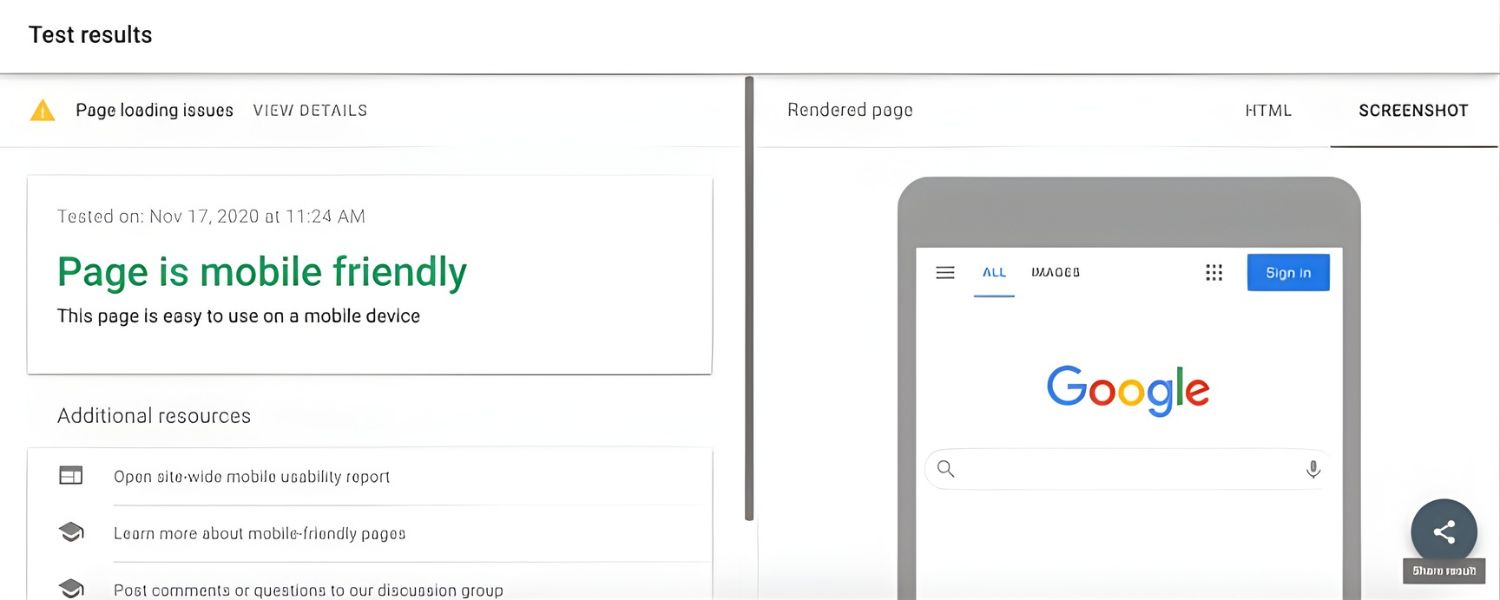
There are a few easy ways to test. Google’s own Mobile-Friendly Test tool (just Google it and enter your URL) will tell you if your page passes the criteria and list any issues. You can also use Google Search Console’s Mobile Usability report if your site is verified there, it will flag pages with errors like small text or content wider than screen.
Additionally, you can simply use your phone and access the site: is it easy to read and use without pinching or zooming? For a deeper analysis, tools like Lighthouse (built into Chrome DevTools) can simulate a mobile device and give you scores for mobile UX and performance. And don’t forget to test on multiple real devices if possible (iPhone, Android, tablet) to catch any device-specific quirks.
Q3: Does being mobile-friendly impact my Google rankings?
Yes – significantly. Google introduced a mobile-friendly ranking boost way back in 2015, and now with mobile-first indexing and the page experience update, mobile-friendliness is a core ranking factor for mobile search. If your site isn’t mobile-friendly, it may not rank at all on mobile searches. Even on desktop search, an extremely poor mobile experience could indirectly hurt your rankings due to overall site quality signals.
Also, features like being eligible for Top Stories (news carousel) often require pages to be mobile-optimized (historically via AMP or Core Web Vitals thresholds). In short, Google wants to serve users pages that display well on their devices, so a page that fails that test is at a disadvantage. The good news is, by following mobile SEO best practices (responsive design, fast loading, etc.), you’re covering the bases of mobile ranking factors.
Q4: Should I have a separate mobile site (m.dot) or use responsive design?
Responsive design is recommended in almost all cases. A separate “m.example.com” mobile site can work, but it doubles your workload (two versions to maintain) and is prone to errors (missing content on one, incorrect rel-canonical tags, etc.). Responsive sites use one URL and one set of pages that adapt via CSS, which is simpler and ensures consistency. Google explicitly states it prefers responsive design because it’s easier to maintain and less error-prone.
Only in specific scenarios (like a very complex web app or site where mobile users need a fundamentally different interface) might a separate mobile site be justified – and even then, you must be very careful to implement proper redirections and parity. Dynamic serving (same URL, different HTML per device) is another alternative, but it comes with the complexity of user-agent detection. For the vast majority of businesses, a single responsive site is the way to go for optimal SEO and user experience.
Q5: What are some quick wins to improve my mobile SEO?
If you’re looking for quick impactful changes, here are a few:
Enable compression and optimize images – often images are the biggest issue; compressing or resizing large images can drastically improve load times (use tools or plugins to automate this).
Eliminate intrusive pop-ups – if you have a newsletter signup or promo overlay on mobile, consider removing it or making it a smaller banner. This can both improve UX and avoid Google penalties.
Improve your site’s TTFB by using caching or a CDN – a faster server response helps everything else.
Check for any blocked resources in your robots.txt (ensure you’re not accidentally blocking CSS/JS that mobile Googlebot should fetch, you want Google to render your page fully).
Use content accordion/tabs for long content on mobile – this keeps your pages shorter to scroll without removing content (users can expand as needed). Google is fine with content in accordions for mobile UX purposes, and it still counts it for SEO. By implementing these, you can often see improvements in both user engagement and search rankings relatively quickly. Remember, every small improvement in mobile experience can translate to better SEO performance in a mobile-first world.

Why Roseville Startups are Choosing Offshore Marketers to Scale Smarter
Roseville is no longer just a quiet suburb of Sacramento;...

What Is PPC? A Practical Guide to Pay‑Per‑Click Advertising
Pay‑per‑click (PPC) is the “pay only when someone clicks” branch...

Google Search Issues Affecting Results in Some Regions
Google has confirmed a problem with one of its data...

Keyword Counts Dropped After Google’s num=100 Change
In September 2025, Google stopped supporting the &num=100 parameter. This...

Image SEO: Optimize Images for Higher Rankings & Traffic
Introduction Images make your website more engaging, but they can...

.png)
.png)
.png)
.png)
.png)

2024 ALL RIGHTS RESERVED MADE IN INDIA
.png)